
Table of Contents
Introduction
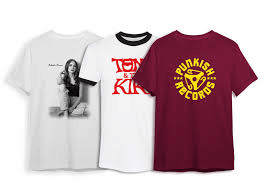
Custom t-shirts have become one of the most creative and powerful ways to express identity, whether it’s for a brand, business, sports team, or special event. Among the many printing methods available, screen printed t-shirts continue to stand out for their vibrant colors, durability, and professional finish. But here’s the truth, not every design turns out as impressive as you imagine it.
The difference between a shirt that people wear proudly and one that ends up forgotten in a drawer often comes down to design. A well-thought-out concept, balanced colors, and strategic layout can make all the difference. Designing screen printed t-shirts that grab attention requires creativity, planning, and an understanding of how printing techniques translate onto fabric.
In this article, we’ll break down the key steps and insider tips to help you create screen printed t-shirts that truly stand out, designs people will actually want to wear again and again.
1. Start with a Clear Purpose
Before you even begin sketching ideas or choosing fonts, you need to understand why you’re designing the shirt.
Ask yourself:
- Is this for a business promotion?
- A team uniform?
- A community event or merchandise drop?
Your purpose determines your message, tone, and visual style. For example, a shirt for a corporate team should look sleek and minimal, while one for a music festival can be bold and artistic. When your design aligns with your purpose, it naturally connects better with your audience.
2. Keep Your Design Simple but Impactful
The best screen printed t-shirts don’t try to do too much. Overly complex designs can look cluttered, especially after printing.
Focus on one main idea or graphic element that communicates your message clearly. Use supporting details like text or small icons sparingly. The cleaner your layout, the stronger your message appears.
Remember, simplicity isn’t boring, it’s about clarity and focus. Think of iconic designs like Nike’s swoosh or the classic Hard Rock Café shirt, both are simple but instantly recognizable.
3. Choose the Right Color Palette
Color is one of the first things people notice on a t-shirt, so your palette should be both attractive and readable.
A few quick guidelines:
- Use contrasting colors (e.g., white on black, red on gray) for strong visibility.
- Avoid pairing colors that clash or blend into each other.
- Keep your palette to 2–4 colors max for cleaner screen printing and lower costs.
- Test how your design looks on different shirt colors before finalizing.
If your brand already has signature colors, stick to those for consistency. Otherwise, experiment with seasonal trends, like soft pastels, earthy tones, or neon pops, depending on your audience and message.
4. Select the Right Font and Typography
Typography can make or break a t-shirt design. It communicates personality, mood, and tone, even before someone reads the words.
Here’s what to keep in mind:
- Choose fonts that match your brand’s voice (e.g., bold sans-serifs for modern brands, handwritten styles for creative ones).
- Make sure your text is readable from a distance.
- Avoid using too many fonts, two at most is ideal (one for headlines, one for supporting text).
- Test how your font prints at different sizes; some thin lines may not transfer well onto fabric.
When done right, your typography will balance beautifully with the rest of your design elements.
5. Focus on Placement and Balance
Where you place your design on the shirt matters just as much as the design itself. The most common placement is the center chest, but depending on your goal, you can get creative with:
- Pocket-sized logos for a subtle look.
- Large back prints for events or promotional wear.
- Sleeve designs for unique detail.
- Off-center or wrap-around designs for modern, trendy appeal.
Before final printing, create a mock-up to visualize proportions. Designs that look great on a computer screen may appear too large or too small once printed on actual fabric.
6. Understand How Screen Printing Works
Designing for screen printing requires a basic understanding of the process. Each color in your design is printed using a separate screen, which means more colors = higher cost and complexity.
Keep these technical points in mind:
- Avoid gradients or very fine details, they don’t always translate well to fabric.
- Use solid color blocks for the best results.
- Make sure your artwork is in vector format (like .AI or .EPS) for sharp, scalable printing.
- Work closely with your printer to ensure your design aligns with their printing capabilities.
Knowing these fundamentals helps you design smarter and ensures your shirts look exactly as you envisioned.
7. Use High-Quality Artwork
Low-resolution images often lead to blurry or pixelated prints. To avoid this, always design in 300 DPI resolution or use vector graphics that maintain quality at any size.
If you’re not a designer, consider hiring a professional or using design tools with pre-set templates specifically for t-shirt printing. It’s a small investment that makes a huge difference in the final result.
8. Choose Quality Fabric for a Premium Feel
Even the best design can fall flat if printed on poor-quality fabric. The shirt’s texture, weight, and color all affect how the print appears.
Cotton is the most common choice, but there are blends like cotton-polyester that offer better durability and comfort. Darker fabrics may require an additional white base layer for vibrant colors, which can slightly increase cost.
Always sample the fabric before mass production, feel it, stretch it, and test how it holds ink. Quality fabric ensures your design looks great and feels comfortable to wear.
9. Make It Personal and Meaningful
The most memorable t-shirts are those that tell a story. Whether it’s your brand message, a funny quote, or a piece of art that resonates emotionally, people love shirts that mean something.
Think about what your design represents. Is it inspiring? Funny? Nostalgic? The more personal and relatable your concept, the more likely people will connect with it, and actually wear it often.
10. Stay Ahead of Design Trends (Especially for 2025)
T-shirt design trends evolve constantly. In 2025, expect to see bold minimalism, futuristic typography, and abstract graphics take center stage. Oversized prints, retro-inspired art, and eco-conscious themes are also gaining traction.
While it’s good to keep up with trends, don’t lose sight of your brand identity. The goal is to create something timeless that still feels modern and relevant.
11. Test Before Full Production
Before printing hundreds of shirts, always order a sample first. This allows you to check print quality, color accuracy, and fabric feel.
Use the sample to get feedback from team members or customers. Sometimes a small tweak in color tone, logo size, or placement can make a huge difference in the final batch.
12. Partner with a Reliable Screen Printing Company
Even the most stunning design can be ruined by poor execution. That’s why choosing an experienced screen printing company is crucial.
Look for printers who:
- Offer design proofing and consultation.
- Use high-quality inks and sustainable materials.
- Have positive client reviews and previous work examples.
- Can handle bulk orders without compromising quality.
A good printing partner can also guide you through design adjustments and printing techniques that will bring out the best in your shirt.
Conclusion
Designing screen printed t-shirts that stand out is both an art and a strategy. It’s about combining creativity, clarity, and practicality to create something people love to wear.
By understanding your purpose, keeping your design simple, choosing the right colors and fonts, and paying attention to the printing process, you can transform a plain t-shirt into a powerful piece of wearable art.
So whether you’re designing shirts for your brand, your team, or your next big event, take the time to craft something meaningful. Because when design meets purpose, your shirts won’t just stand out, they’ll make a lasting impression.


